
MapMyFitness is a suite of five different apps: MapMyRun, MapMyWalk, MapMyHike, MapMyRide, and MapMyDogwalk. Each app has its own color scheme, but they all work identically, and pull user data from the same database. These apps allow users to record, log, and track their physical activity and food intake. The project is conducted independently of the MapMyFitness Company, by four graduate students including myself in the Human Centered Design and Engineering program at the University of Washington. After an initial assessment of the MMF apps, we saw opportunities for paring down some of the features and streamlining the user interface. The MapMy-online tool suite was redesigned based on two separate evaluations. Right after we finished our last presentation, company renewed the interfaces.
Research Methods and Tools Used
Online Survey, Data Visualization, Field Research, Paper Prototype, Affinity diagrams, Lucid Charts Wireframing, Evaluative Iterative Usability Tests.

First we used it for a while...and wondered...

The main use of this app is to record and track workouts. So why does it start up with this screen of icons? Why doesn't it go right into a map view?

Do people really track their food intake? Is this app the best way to track food intake? Do people really do that?

Do people really share everything on Facebook? Every run, every dog-walk, every hike, everything?

Survey data from surveymonkey.com
MMF’s core market is active, college-educated smart-phone users between the ages of 18 and 40.
We conducted a small survey of likely users to learn more about how they work out, what they track, and how (and if) they share their workout and food data with others. Core users like metrics. 76% of regular exercisers we surveyed have tracked their workouts at some point.
About half have trained for a specific event. MMF provides great metrics. MMF is great at recording and storing workout stats. In fact, that’s the core feature of the app. We wanted to see if there was a way to emphasise that core functionality.

Survey Data Visualization
I took responsibility in all levels of the project, evaluated the survey data and designed the poster. To test our hypotheses, we conducted an online survey of potential MMF users, tested four paper-prototype design alternatives, and created a final redesign proposal.

We developed four design prototypes and conducted a usability test to five subjects.
While testing one of the other designs, a usability participant said, “I know I shouldn't, but i really want to push that giant button!” So we incorporated it into this design for each page’s primary action.
Most likely users care about food, but most don't count calories. 94% of regular exercisers we surveyed pay at least some attention to what they eat. Only 10% of them count calories.
The food logging feature doesn't work. The food database currently used in the app is inconsistent, and the data isn't usable. Portion units are inconsistent. Most people can’t accurately estimate portion size anyway. We removed the food logging “feature” from our redesigned version of the app. (Maybe at some point MMF could partner with third party to offer a food-logging feature in the premium version.)
Most people don’t post workouts on Facebook, Twitter, etc. but they do work out socially. So we came up MapMyFitness Teams, a new way to share workouts, and to work out socially. This Teams concept will be offered as a premium feature. Team captains can start teams, and can invite people to join their teams. They can organize team events (training rides, group runs, pickup games, etc.) that are shared and recorded through the app. Team members can join teams. They can see other team members on their map view, and compare stats. (Lap time, pace, etc.). There’s a lot of potential for Teams concept. Event-based teams or local sports leagues might get sponsorships through the apps. Or the company you work for could provide free MMF team memberships as part of a corporate wellness program.Maybe you'd get a MMF team membership when you register for a 5K charity run.

New home page. Dashboard design starts in map view. “Big button” concept used as a way to orient yourself throughout the app.

While working out app records and shows your data on the screen.
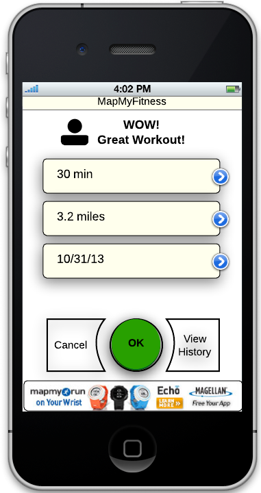
End of workout screen.

Logging a workout-first screen.

Logging a workout-selecting the date and data.

Teams screen.
Based on user feedback we came up with a new main page with a dashboard-style design. And this dashboard layout is consistent throughout the main pages of the app. I designed the wireframes with the Lucid Charts prototype program according to the results of the usability tests conducted by our group.
So we took a close look at the navigation, features, and business model of the existing app, and based our changes on a survey of likely users, and well as research in the field.

UI flow of the old design. Includes a lot of functions. Hard to tell from any one screen where you are in the navigation and when you've gone off course.

Our proposed UI Flow. Reduces the amount of clicking users have to do to get what they want. Simpler and faster to get through primary activities
Solutions Proposed
Our proposed redesign emphasizes the core features of the app--what MapMyFitness does particularly well. We determined that the existing food logging function adds little value for users, while incurring excessive overhead and upkeep costs to the company. Its removal could provide an opportunity to partner with another company to provide premium content.
In addition, the new Teams feature provides a new, targeted revenue and data stream for the company; bringing a new way to share workouts and to work out socially. This Teams concept is considered to be offered as a premium feature.
We determined that the existing food logging function adds little value for users, while incurring overhead and upkeep costs to the company. Its removal could provide an opportunity to partner with another company to provide premium content.